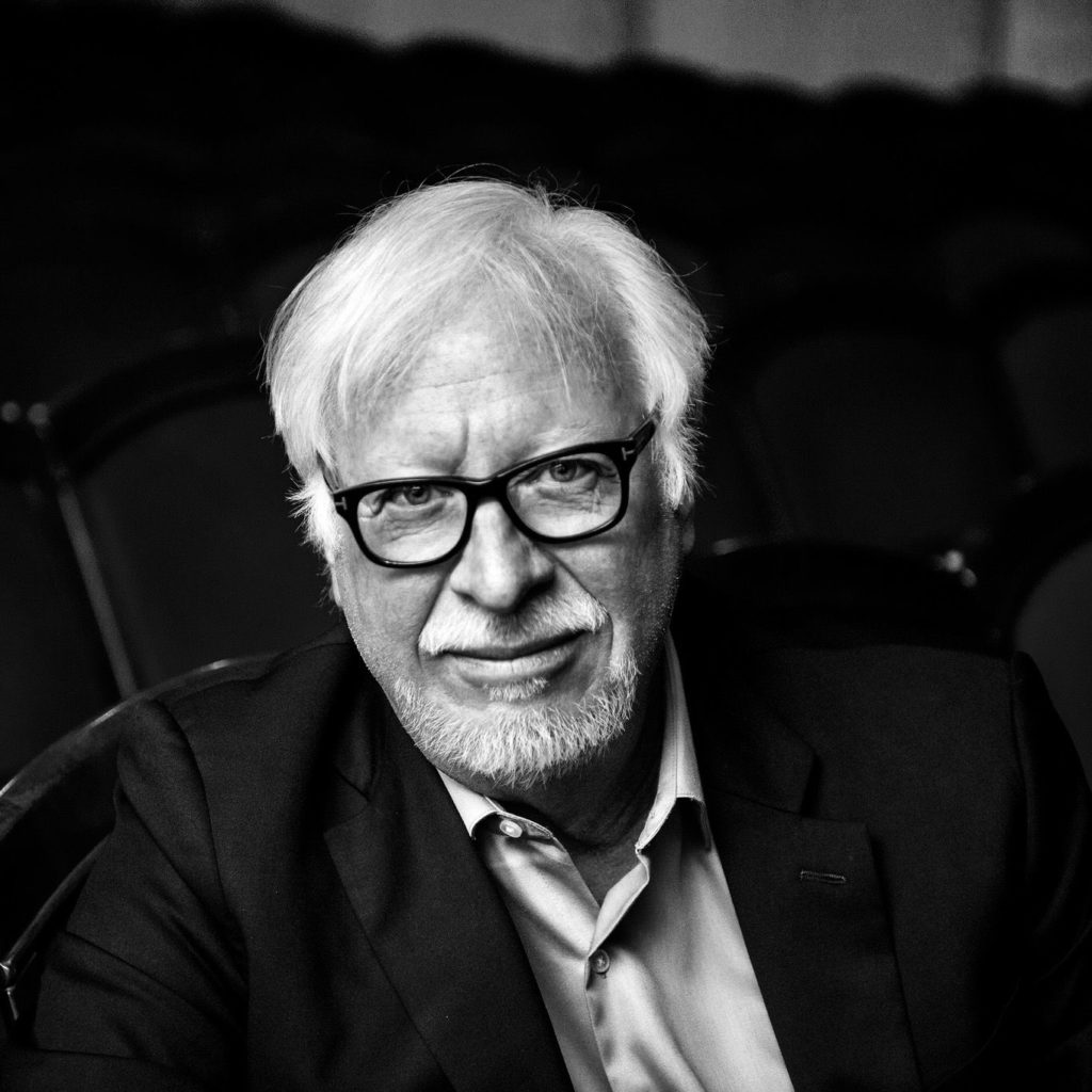
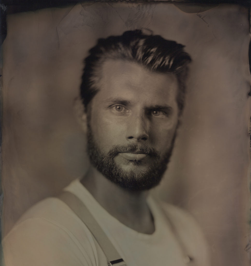
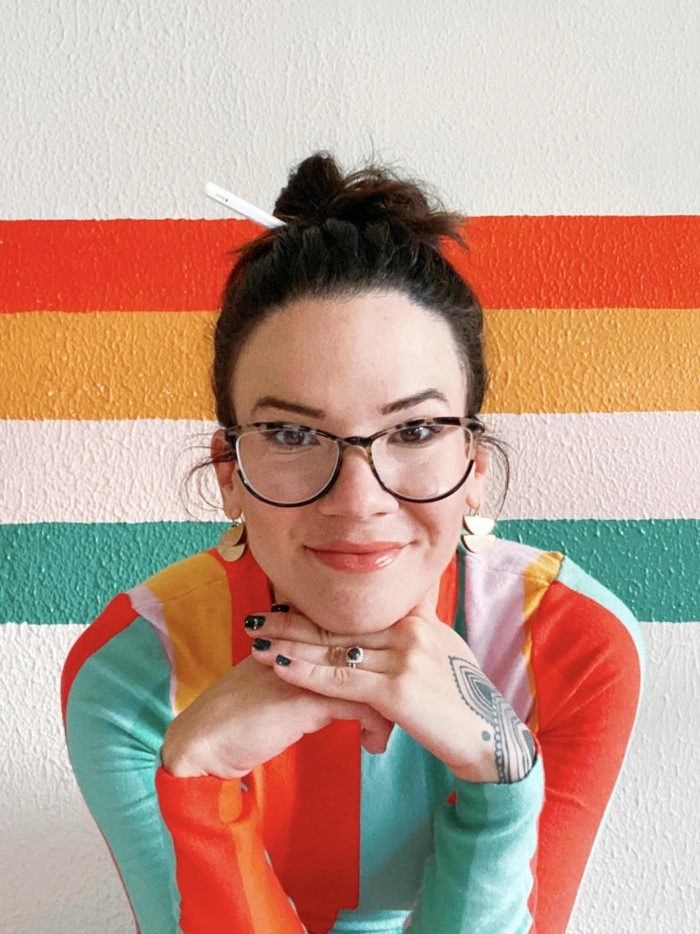
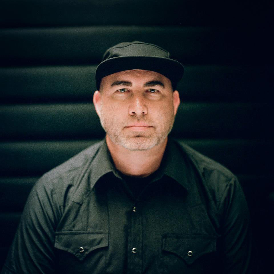
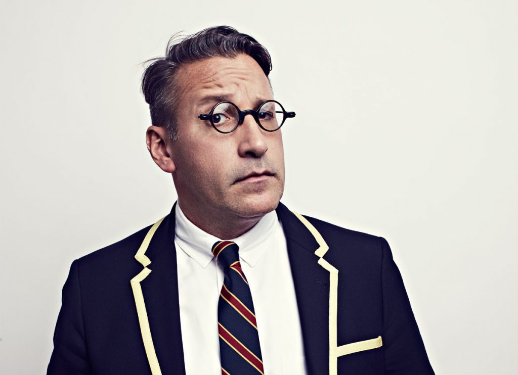
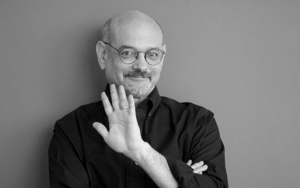
Todd Radom is a team player…quite literally. He is a slugger, a sports branding expert, a craftsman, and a historian. He has become endemic to sports culture.
Radom has done logos for just about every big event in American professional sports. Todd’s work includes the official logos for Super Bowl XXXVIII and the 2009 NBA All Star Game, as well as the graphic identity for Major League Baseball’s Washington Nationals and Los Angeles Angels.
Among the leading designers in the professional sports industry, his two decades of work with the NFL, NBA, and Major League Baseball have resulted in some of the most familiar icons of our popular culture.
The baseball season just came to an end with the Kansas City Royals defeating the New York Mets to win the World Series, perfect timing for us to score a DQSD interview with the king of sports iconography.
Q. What was it like being a Red Sox fan growing up in New York?
I grew up 11 miles due north of Yankee Stadium. Which is to say, whatever doesn’t kill you makes you stronger. Excellent life lessons right there.
Q. Best New York City decade?
The ‘80s. Yes, it was a little bit dangerous, yes, it was a little bit messy, but it was the Capital of Creativity back then. I lived in the Y on 34th and 9th while in college, 1982-83. I could write an entire book about what I saw, who I met, and what inspired me.
Q. What’s your perfect Sunday look like?
 Get up sometime around 8. Coffee, and lots of it. Lounge. Read. Rinse. Repeat. And we have a tradition in my house every Sunday night, a cocktail at around 9PM. What it is varies with the season, but it’s a standing ritual. Ends the weekend on an up note.
Q. World Series, nationally televised, do you feel confident throwing out the first pitch (no practice)?
I’ll say this: I played in a charity softball game in Florida several years ago, I batted against Bill “Spaceman” Lee, former Red Sox pitcher and well-known baseball eccentric. He threw me three straight 12-to-6 curveballs and I swung out of my shoes, missing all three. Based on that experience, I’d take my chances with that first pitch (cue the worst celebrity first pitches).
Q. Which logo do you like the best, Mets or Royals, and why?
Mets! While KC’s logo is a solid one, I have a strange affection for what they used to use, with the large “R”in the shield. Add to that the fact that the Mets logo includes the Woolworth Building, which is one of New York’s oldest and most underrated skyscrapers.
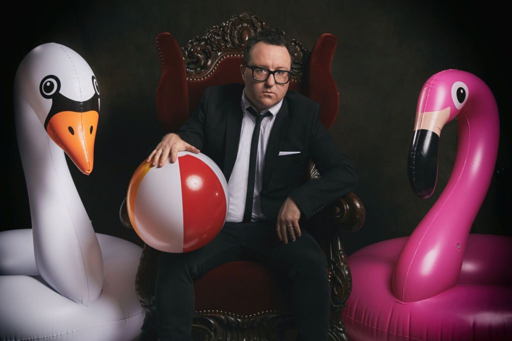
Now caption this bad stock photo.


